Skip to content
Insights/Making complex products legible: a guide for industrial brands
Nick Markov·AI Generalist·8 min read·April 2026

Making complex products legible: a guide for industrial brands

When a product is too complex for a catalogue photo to explain, a 3D interactive is usually the answer. But "usually" isn’t always, and picking the wrong pattern is expensive.

Making complex products legible: a guide for industrial brands

By Nick Markov · April 2026 · 9 min read


A procurement manager at a Korean municipal utility is trying to understand a wastewater treatment plant. Not the chemistry. The equipment. Specifically: which sludge scraper goes where, what a bar screen does upstream of a clarifier, and why the proposal in front of him quotes one configuration over another.

He has a 60-page PDF. He has photographs of installed equipment, taken at angles a photographer thought looked impressive. He has an hour before his next meeting. He has, in other words, every artifact a B2B industrial brand traditionally produces, and none of the legibility he actually needs.

This is the shape of the problem. Industrial products have to be understood before they can be bought. The catalogues that explain them were built for an era when the buyer was already an expert. That era is over for most of the people writing the cheques.


The complexity tax

When a product is hard to explain, the cost shows up in places marketing rarely measures.

The sales cycle stretches. Every first call burns thirty minutes on what the product is, before any conversation about whether it fits. Senior engineers fly out for demos that should have been preventable. Quotes get drafted and re-drafted because the buyer keeps surfacing requirements the catalogue should have answered up front.

Support burden shifts left, into pre-sale. The application engineer becomes a translator for the website. Buyers email questions whose answers exist in the manual but not in any form a non-specialist can find.

Internal champions struggle. The procurement manager who liked the product can't carry it through their committee, because the materials they have don't survive being read by a CFO or a regulator. Deals die not because the product was wrong but because the buyer couldn't defend it without us in the room.

This is the complexity tax. It is paid in time, in deferred revenue, and in deals that close late or not at all. Most industrial companies pay it without naming it.


40 min

First-call burn

Average time spent explaining the product before scope can be discussed.

60 pg

PDF nobody reads

Typical install or operations manual the procurement manager will not finish.

2–3

Re-quotes per deal

Requirements the catalogue should have answered surfacing late.

1

Defensible image

What the internal champion actually needs to carry the product through committee.

Four ways to reduce the tax

The instruments available to a marketing team run from cheap to expensive. None of them is the right answer for every product. The question is which one matches the gap between what your buyers need and what your current materials deliver.

Better photography

The cheapest move and frequently the most underrated. A good industrial photographer knows the difference between showing a product and explaining it. Cross-section cuts. Detail shots of the parts that matter. Scale shots with a human in frame. Lighting that surfaces texture instead of flattening it.

If your current photo library is hero shots in a clean studio, you are losing a chunk of legibility you could recover for under five thousand dollars. Photography is not a substitute for 3D, but it is often a prerequisite. The same buyer who needs a 3D walkthrough later still needs a single defensible image to put in their internal slide deck this afternoon.

A 3D viewer or short explainer

A step up. A single 3D model the buyer can rotate, zoom, and inspect on a product page. Or a 60-second animated explainer showing how the product works.

This is the right instrument when the product is one object with internal mechanisms that photography flattens. A pump. A compressor. A valve. The buyer is not configuring anything. They are confirming what they already half-understand. A rotateable model with a few callouts does that job. An explainer animation does it for buyers who prefer to be walked through rather than to explore.

An interactive 3D walkthrough

The instrument that earns its keep when the product only makes sense in context. A full plant. An assembly line. A multi-stage process. The buyer needs to see how the pieces relate, not just what each piece looks like.

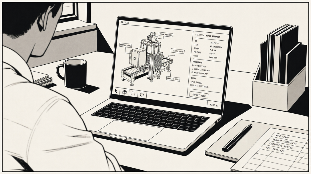
We built one of these for Dowon APEX. A full wastewater treatment plant in the browser, with twenty-plus pieces of selectable equipment, each surfaced in its operational position with the spec sheet a distributor actually needs during a quote. The 3D tool replaced the first forty minutes of what used to be a slide-based product pitch. Distributors now open it as the first move of a sales call, not the last.

DY Engineering's black-mass battery recycling system is a sibling pattern. Same underlying scene, three annotation layers (safety for regulators, throughput for investors, maintenance access for operators). The DYENG sales team now sends a specific stage URL to a specific prospect as the first touch, before any call. The prospect interacts, absorbs what they care about, and books the meeting already up to speed.

A multilingual assembly or training tool

The most ambitious instrument. Built when the buyer has to do something with the product, not just understand it. Install it. Maintain it. Train operators on it. And do it across languages, often in field conditions where connectivity is unreliable.

Moojin's earthquake-resistant ceiling systems shipped with a 180-page PDF manual that nobody read end-to-end. We replaced it with a tablet-deployable interactive 3D guide in Korean and English. Senior installers stopped flying out for first-pass training in new markets. The conversations on-site shifted from here is how a panel attaches to harder questions about retrofits and irregular ceilings. The replicable parts of the work moved into the tool.

SW Valve was the same shape with different physics. Industrial valves installed by contractors working in their second or third language, in shipyards and offshore platforms with no reliable signal. We built cross-section views, reverse-mode for disassembly, and a static-image fallback that exports per step. The tool had to load once and work without re-fetching anything. An assembly tool that fails at the job site is worse than a PDF.
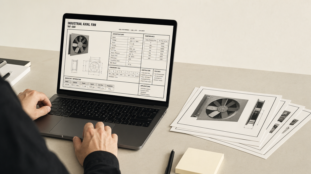
Before: the 60-page PDF
After: the 3D walkthrough

How to pick the right one

The decision is rarely about the product. It is about the buyer and where they sit in the funnel.

If the buyer is at the top of the funnel and you have thirty seconds of their attention, photography wins. Spend on a photographer, not on WebGL.

If the buyer is mid-funnel and they are confirming what they already half-understand, a 3D viewer or a short explainer is enough. They do not need to drive; they need a clearer picture than the catalogue offered.

If the buyer is mid-funnel and the product is a system rather than an object, a walkthrough is the right move. Plants, lines, processes. The buyer needs to see how the pieces relate before any single spec sheet means anything.

If the buyer is post-sale and they are about to do something physical with your product, build the tool that helps them do it. Assembly. Training. Maintenance. The ROI here is not in pipeline; it is in calls deflected, errors avoided, and senior staff freed from teaching the same workflow twice a year.

A useful exercise: write down the buyer's next physical action after reading your materials. Open a manual. Forward the page to a CFO. Cite a spec in a regulatory filing. Train a junior. The instrument that helps them take that next action well is usually the right one to build.


Four instruments, four buyer positions

InstrumentWhen it winsTypical entry priceRepresentative shipped work
Better photographyTop of funnel, thirty seconds of attention, single defensible image needed.$3K–$8KStudio commissions through our network
3D viewer or short explainerMid-funnel, single object with internal mechanisms photography flattens.$3K–$10KDaedong, KOAI, KBIC
Interactive 3D walkthroughMid-funnel, product only makes sense in context (plant, line, multi-stage process).$7K–$40KDowon APEX, DY Engineering
Multilingual assembly or training toolPost-sale, buyer has to install, train, or maintain in the field, across languages.$8K–$25KMoojin, SW Valve

Common mistakes

Four failure modes worth naming, because we keep seeing them.

Over-engineering for the wrong audience. A 400 MB Unity build for a product page where 80% of traffic is on mobile. A custom shader system for a configurator that needed baked lighting. The tech should be the cheapest possible thing that delivers the experience. We have walked into more than one project to discover the previous agency built a Hollywood pipeline for a brochure problem.

Treating 3D as decoration. A beautiful hero model with no interaction logic, no navigation, no reason for the buyer to engage. These projects photograph well in case-study reels and convert nothing. The interaction design (what the buyer does and learns) is the actual product. The 3D asset is the substrate.

Ignoring mobile. Industrial buyers read on phones at trade shows, at job sites, between meetings. A walkthrough that only works on desktop is a walkthrough most of your audience will not see. Mobile performance budget is a scoping decision, not a polish-phase fix.

Multilingual as an afterthought. A 3D app built in English with Korean bolted on in week ten is not multilingual. It is an English app that some Korean users tolerate. Real multilingual delivery (button regions sized for both scripts, typography that respects both traditions, panels that reflow without truncation) has to be scoped from week one. Korean and English have different word lengths, different sentence rhythm, and different UI expectations. Get this wrong and the tool fails in the field.


The pragmatic close

Most industrial brands do not need the most ambitious version of any of these. They need the version that closes the specific gap between what their buyers need and what their current materials deliver.

That gap is usually narrower than it looks. A better set of photographs and a single 3D viewer on the right product page often does more than a six-month interactive build. The instrument is less important than the diagnosis.

If you are reading this as a marketing director or a product manager, the move is not to commission a 3D project. The move is to write down, in one sentence, the specific complexity tax your product is paying right now. Our sales team spends 40 minutes of every first call explaining how our sludge remover works, and we lose deals when the customer forgets the explanation before the second call. That sentence determines what you should build, and how much of it.

The cost of complexity is real. It is paid quietly, in stretched cycles and dead deals and senior engineers on planes. The instrument that reduces it most is rarely the most expensive one. It is the one matched to the actual gap.


Nick Markov is the AI Generalist at CCLEMANG. He builds most of what the studio ships. Design, engineering, 3D, and the AI-assisted production pipeline.

Back to all insights →

N

Nick Markov

AI Generalist at CCLEMANG

Writes code, writes copy when needed, and refuses to let a project end as a half-finished thing.

Related reading

Want something like this for your product?

Tell us what you're building. We reply inside 24 hours.